Branding & Packaging
The brief is never really about the label.


Nobody approaches your stand six times for the product alone
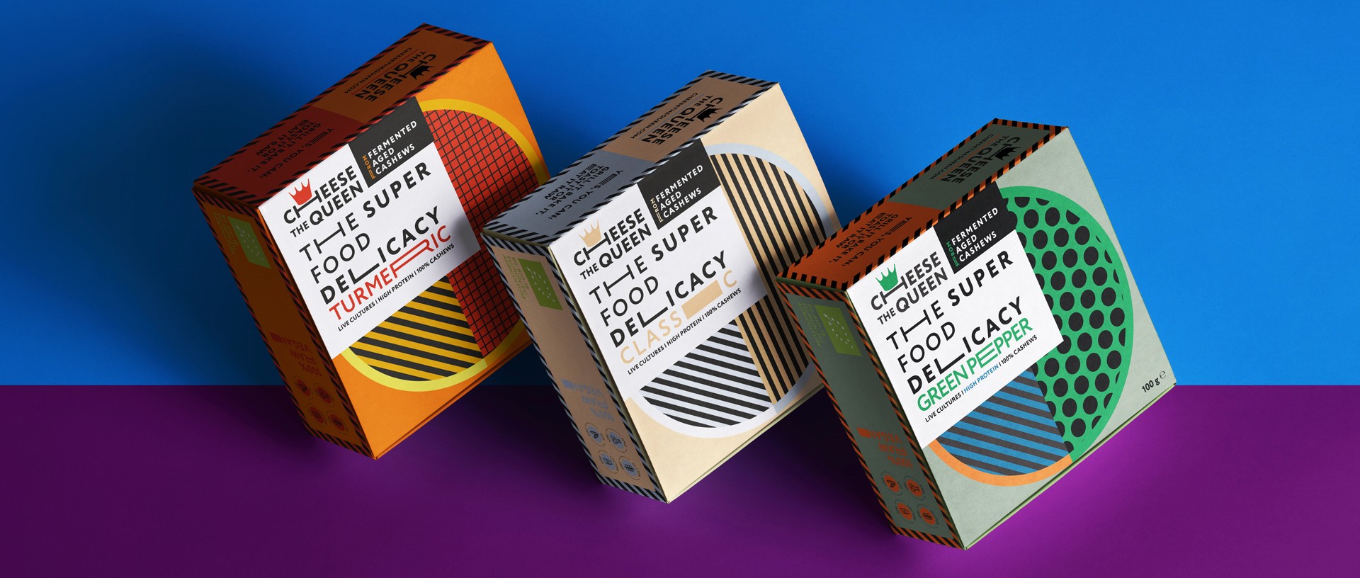
A Bulgarian vegan cheese sold across Europe and used as an ingredient in professional kitchens - so the redesign had to work at shelf level, at scale, and in a sector where most brands play it safe with earthy tones and clean lines. We went the other way: bold colours, unexpected patterns, nothing that looked like it was afraid of itself. The owners were shocked first and converted second, which is usually the right order. They took it to BIOFACH in Nuremberg - the world's largest organic food fair - and by the last hour, six designers had walked up just to ask who did the packaging. The inside of the box got its own treatment too, because a nut cheese is something you open more than once, slowly, over time. It deserved to have something worth finding.



Nobody reads a label they have to turn. They experience it.
A boutique Sofia roastery launching their first cold brew - across Bulgaria and into European retail - needed more than a label. They needed a brand that could grow: cold brew today, matcha lemonade next season, whatever comes after that. The brief was modern but broadly appealing, shelf-competitive against soft drinks and energy drinks, and built to last. The interesting decision was structural: instead of the standard vertical label that you read top to bottom, we wrapped the design horizontally around the full 360° of the bottle. You have to turn it to read it. That rotation became the experience - something you notice in a shelf of things designed to be glanced at.


Some constraints tell you exactly what the design needs to be
One of Bulgaria's first local bio farms - chicken, beef, pork, with vegetables and dairy coming - needed packaging that could scale with the range without becoming a production problem. The owner is the kind of entrepreneur who builds entire supply chains from scratch, so the brief had its own logic: make it easy to apply, keep it cost-efficient, don't let the packaging become the project. Clean, flexible, honest about what's inside. The constraint was the creative direction - when you can't over-engineer the solution, you learn quickly what actually matters about a label.